TAN – NIMBUS: The Groovy Retro Display Font Every Modern Designer Needs
Introduction to TAN – NIMBUS
Not every font makes you feel something. TAN – NIMBUS does.
The moment it hits a layout, it pulls the whole composition into its orbit — liquid, confident, and dripping with that unmistakable 70s energy that design culture keeps coming back to. It’s psychedelic without being chaotic. Retro without feeling dated.
TAN – NIMBUS sits at the intersection of vintage nostalgia and contemporary cool, and that is exactly why it’s become one of the most visually distinctive display fonts available to designers working in 2024 and beyond. If your project needs personality, this font doesn’t whisper it. It announces it.
Design Features & Visual Impact
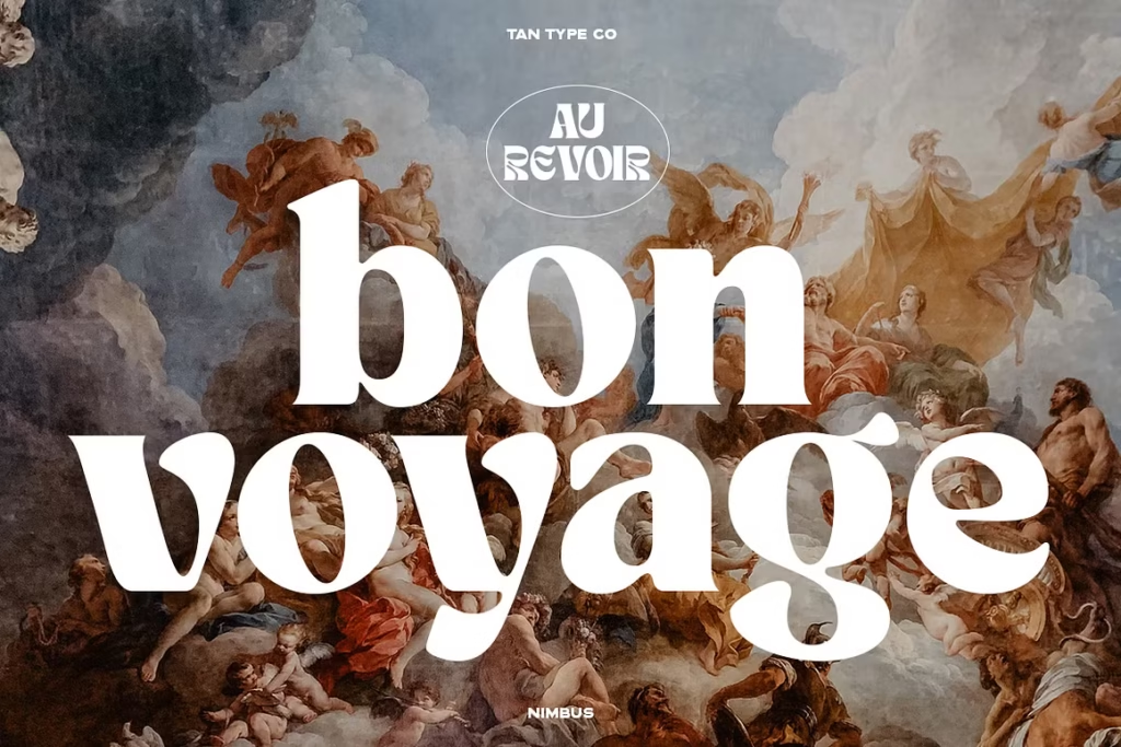
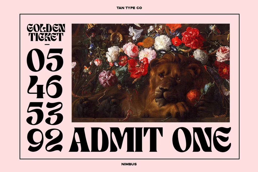
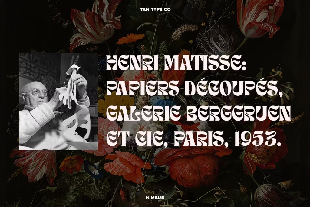
The defining characteristic of TAN – NIMBUS is its letterform movement. Every character carries a fluid, almost molten quality — like the letters were shaped by slow-moving water rather than a rigid grid. The curves are generous, the strokes swell with intention, and the overall silhouette of each glyph feels alive.
This is a high-contrast display font built for maximum visual impact at large sizes. The interplay between thick and thin strokes creates a rhythm across headlines that draws the eye naturally from one letter to the next.
What makes it genuinely special for designers:
- Psychedelic, liquid letterforms with smooth flowing curves and swelling strokes
- High contrast between thick and thin elements for striking visual depth
- Bold, confident display weight that commands attention in any layout
- Groovy, round character shapes with a warm, organic feeling
- Clean vector construction that scales flawlessly for both print and digital output
- Distinctive retro personality that pairs beautifully with minimal, modern layouts
It’s worth noting what TAN – NIMBUS is not — it’s not a body text font, and it doesn’t try to be. It was designed with complete commitment to its role as a headline display face, and that singular focus is precisely what makes it so effective.
Best Creative Use Cases
Trendy Social Media Content, TikTok Graphics & Instagram Aesthetics
The current visual language of social media is deeply rooted in retro-modern aesthetics, and TAN – NIMBUS speaks that language fluently. It performs brilliantly on Instagram carousel covers, TikTok video title cards, Pinterest graphics, and Reels thumbnail overlays.
Pair it with muted earth tones, warm creams, or bold color-blocked backgrounds and the typography does most of the design work for you. It’s the kind of font that stops the scroll without needing any additional decoration.
High-End Modern Branding, Creative Logos & Wordmarks
Despite its retro roots, TAN – NIMBUS integrates naturally into premium modern branding. Boutique creative agencies, independent fashion labels, lifestyle brands, and music artists are all drawn to its balance of character and sophistication.
As a wordmark font, it creates logos that feel handcrafted and culturally aware. It communicates that a brand has a strong point of view — and in today’s saturated market, that kind of visual conviction is worth more than almost any other brand asset.
Apparel Design, Fun Merchandise, Tote Bags & Poster Layouts
TAN – NIMBUS thrives in print. Its bold, graphic letterforms translate beautifully to screen printing, embroidery digitizing, and direct-to-garment processes. A single word set in this font can carry an entire T-shirt design.
For poster layouts, it delivers that vintage gig-poster energy that audiences genuinely respond to. Pair it with textured paper mockups, halftone overlays, or grainy gradients and you have a complete aesthetic without needing to build a complex composition from scratch.
Merchandise designers working in print-on-demand will find it especially valuable — it produces standout products that look designed rather than templated.
Why Creative Professionals Need TAN – NIMBUS
There’s a reason TAN – NIMBUS has built a dedicated following among agency designers and independent creatives alike. It solves one of the most persistent challenges in modern design: how to make a clean, minimal layout feel genuinely interesting.
Minimalism is powerful, but it demands strong typographic anchors. A single headline in TAN – NIMBUS gives a sparse layout the visual weight and cultural personality it needs to feel complete. You don’t need ten design elements competing for attention when one typeface carries this much presence.
For designers working across multiple client industries, it’s also a remarkably flexible tool. It moves comfortably between music branding, fashion, wellness, food and beverage, and lifestyle categories without ever looking out of place. That cross-industry versatility is what earns a font a permanent spot in a professional’s toolkit rather than a single-project folder.
Agency creatives appreciate how efficiently it communicates a direction to clients. Present a mood board anchored by TAN – NIMBUS and the aesthetic conversation starts at a significantly higher level.
Conclusion & Call to Action
TAN – NIMBUS is the rare display font that manages to be both deeply specific in its aesthetic and broadly useful across creative industries. Its psychedelic, retro-modern personality brings immediate visual impact to social media content, luxury branding, merchandise design, and editorial layouts — without ever feeling like a costume rather than a considered design choice.
It’s bold enough to lead a layout. Refined enough to represent a premium brand. And distinctive enough that anything set in it becomes immediately recognizable as a confident creative statement.