Santorini Sunshine: The Elegant, Sun-Drenched Typography Every Creative Needs
Introduction to Santorini Sunshine
Close your eyes and picture whitewashed walls, cobalt blue domes, and the warm glow of a Mediterranean afternoon. Now imagine capturing that exact feeling inside a font.
That’s Santorini Sunshine.
This beautifully crafted typography piece brings the effortless elegance of a Greek island escape directly into your creative work. It radiates warmth, openness, and a kind of unhurried luxury that immediately elevates whatever layout it touches — without trying too hard to do so.
For designers working in lifestyle, travel, wellness, or fashion, Santorini Sunshine fills a very specific and valuable gap: it gives your work the visual softness and premium glow of a high-end editorial spread, right from the moment you start placing type on the page.
Design Features & Aesthetics
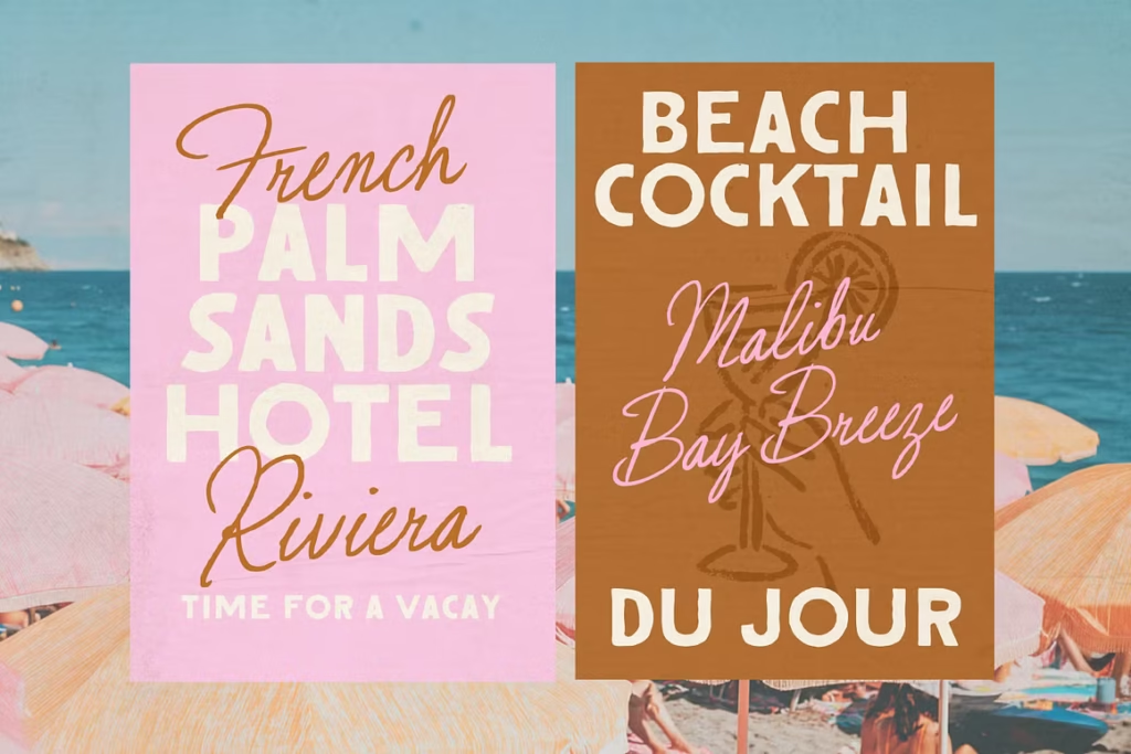
What immediately distinguishes Santorini Sunshine is the quality of its line work. The characters flow with a natural, unhurried grace — neither too stiff nor too casual — sitting in that sweet spot that makes a layout feel both considered and effortless.
The letterforms carry a bright, airy quality that’s difficult to manufacture and nearly impossible to fake with a generic script alternative. This is typography that looks like it was designed for a specific mood, and that mood is pure sun-warmed sophistication.
Key design qualities that make Santorini Sunshine stand out:
- Fluid, graceful letterforms with smooth connections and elegant proportions
- Airy, open character spacing that breathes beautifully in both print and digital contexts
- Refined stroke variation between thick and thin elements for genuine visual depth
- Versatile scale performance — equally stunning at large display sizes and smaller accent text
- Clean, precise vector construction that translates flawlessly across print, web, and packaging
- A warm, editorial personality that pairs naturally with photography, illustration, and minimal layouts
It integrates without friction into Adobe Illustrator, Photoshop, Canva, and most modern design environments. The technical quality matches the visual quality — and that reliability matters enormously when you’re working against a client deadline.
Best Creative Use Cases
High-End Travel Branding, Resort Logos & Wordmarks
Santorini Sunshine was made for the travel and hospitality industry. Boutique hotels, luxury villa rentals, curated travel agencies, and high-end resort brands all rely on typography to communicate the caliber of their experience before a guest ever arrives.
This font delivers exactly that first impression. As a wordmark face, it communicates warmth, exclusivity, and a genuine sense of place — qualities that drive booking decisions in competitive travel markets.
Summer Campaign Product Packaging — Skincare, Fragrances & Apparel
Seasonal campaigns live on the strength of their visual atmosphere. Santorini Sunshine brings the kind of sun-bleached, golden-hour aesthetic that skincare brands, fragrance houses, and summer apparel collections are consistently chasing.
Set it against soft sand tones, warm whites, or deep terracotta backgrounds and the packaging practically radiates heat. It’s an ideal typographic choice for limited-edition summer collections where the visual mood is as important as the product itself.
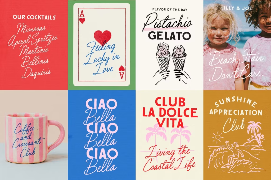
Wedding Stationery, Mood Boards & Editorial Magazine Layouts
In the wedding stationery world, couples want their aesthetic to feel personal, elevated, and emotionally resonant. Santorini Sunshine delivers all three. It’s stunning on invitation suites, ceremony programs, place cards, and welcome signage — especially for destination weddings and garden ceremonies where a warm, romantic palette is the foundation.
Editorial designers working on lifestyle, travel, and bridal magazine spreads will find that it integrates into multi-column layouts with quiet confidence. It enhances photography without competing with it, and it gives mood boards an instant cohesion that would otherwise take considerably longer to build.
Why Creative Professionals Need This Style
The most time-consuming part of any design project isn’t the execution — it’s finding the right visual direction and locking it in quickly enough to stay on schedule. Santorini Sunshine shortens that process significantly.
The moment this typography enters a layout, it establishes a mood. The color story, the photography direction, the supporting typefaces — they all become clearer because the primary font is doing the atmospheric work upfront. For agency designers managing multiple concurrent client projects, that kind of typographic clarity is a genuine time asset.
It also speaks directly to what high-end clients and modern lifestyle consumers are drawn to right now: warmth, authenticity, natural beauty, and the quiet confidence of a well-composed aesthetic. Santorini Sunshine embodies all of those qualities without requiring extensive supplementary design work to make them land.
Freelancers building out a premium client portfolio benefit equally. Adding this style to your toolkit means you can move fluidly between travel branding, wedding design, beauty packaging, and editorial work — all within a consistent premium positioning that clients notice and are willing to pay for.

Conclusion & Call to Action
Santorini Sunshine is the typographic equivalent of the perfect vacation afternoon — warm, beautiful, and exactly what you needed without knowing it until you experienced it.
It works for luxury travel brands, seasonal product packaging, editorial magazine layouts, and destination wedding stationery with equal grace and visual authority. Its fluid, sun-drenched personality brings immediate atmosphere to any project, and its technical quality ensures it performs beautifully across every format and platform.
For designers who want their work to feel genuinely premium rather than just professionally competent, this is the typography that closes the gap.