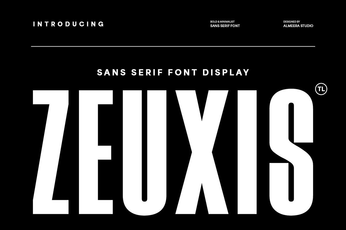
Zeuxis – Bold & Minimalist Sans has a clean and bold design. It stands out in a crowded world of fonts Its minimalist look is perfect for projects needing clear text.
I think Zeuxis is a versatile font. It can make any design project better, from logos to body text. Its modern and bold look is perfect for adding an edge to your work.
Exploring the Zeuxis – Bold & Minimalist Sans
I’ve been trying out Zeuxis, a font that mixes minimalist style with bold looks. It’s getting a lot of attention for its clean lines and modern vibe. This makes it great for many design uses.

Standout Characteristics at a Glance
Zeuxis has bold, geometric letterforms that look elegant and easy to read. Its simple design works well in many places, from digital screens to printed stuff.
Initial Design Applications
Zeuxis is perfect for headings, titles, and branding because of its bold and simple style. It shines in designs that need a strong, modern look.
Zeuxis is a versatile font that can make a design look better with its clean, modern look. Its bold, simple design is great for places where clear and strong are key.
Key Features and Typography Elements
The Zeuxis font has typography elements that stand out. Its bold sans serif style is modern and works well in many designs.
Letterforms and Spacing
Zeuxis’s letters are made for easy reading. They have plenty of space, which adds to its simple look.
Special Characters and Symbols
This font has lots of special characters and symbols. It’s great for many design projects.
From Light to Bold: The Complete Range
Zeuxis is known for its font range. It goes from light to bold, giving designers lots of options.
Italics and Alternative Cuts
Zeuxis also has italics and different cuts. This makes it even more versatile for designers.
Zeuxis is a great choice for designers. It has many typography features, a wide range of characters, and fonts. It’s perfect for those who want a bold, yet simple, sans serif font.
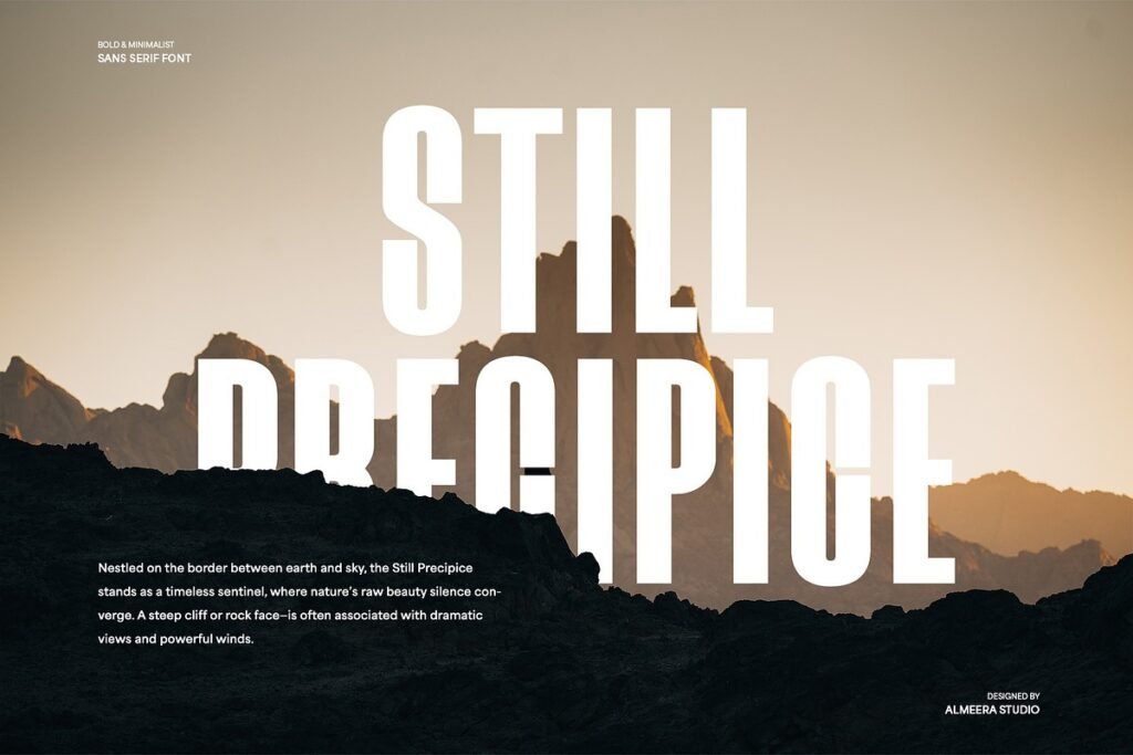
Perfect Applications for Zeuxis Font
Zeuxis is great for many design projects. It’s bold and simple, making it perfect for different media. This includes digital interfaces and print materials.
Digital Applications
Zeuxis is ideal for digital applications. It works well for website headers, mobile app interfaces, and digital signs. Its clean design looks good on all screen sizes.
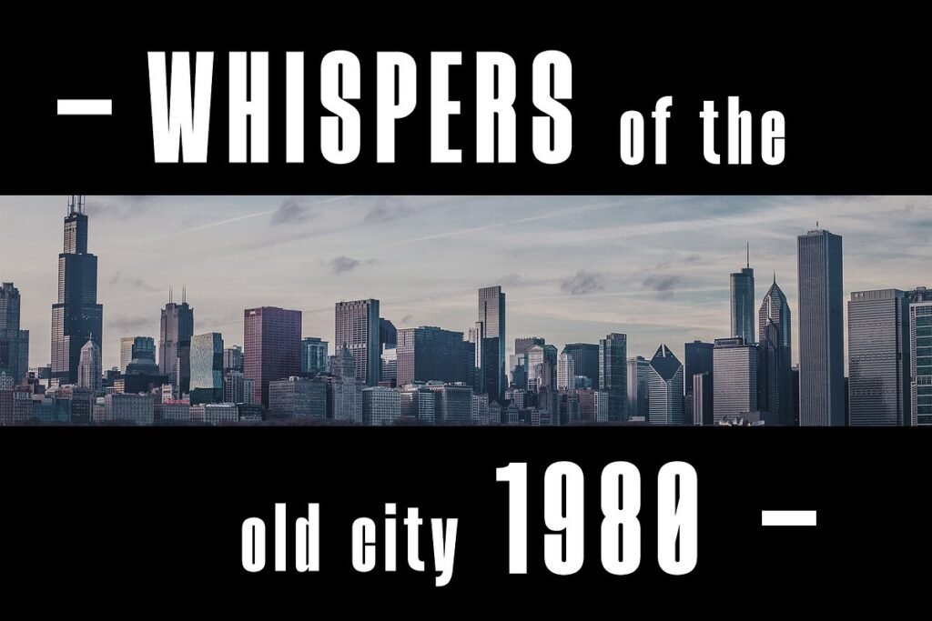
Print and Environmental Design
In print and outdoor design, Zeuxis shines. It’s great for posters, billboards, and signs. Its boldness grabs attention, making it perfect for titles.
Complementary Sans Serifs
Zeuxis looks good with other sans serif fonts. Open Sans or Montserrat pair well with it. They help create a consistent look across different materials.
Contrasting Serif and Display Options
Zeuxis also works well with serif or display fonts. This contrast adds interest and hierarchy to designs. It makes designs more engaging for viewers.
Why I’ll Keep Using Zeuxis in My Design Toolkit
As a designer, I’m always searching for fonts that make my work stand out. Zeuxis is a key part of my toolkit. It mixes boldness with minimalism in a unique way.
This font works well in many projects. It’s great for digital screens and printed materials too.
Zeuxis’s modern style helps me make designs that grab people’s eyes. Its clean lines and shapes are perfect for text. It looks good even when the text is small.
Zeuxis is great for different parts of a design, like headings and body text. It keeps its impact no matter where it’s used. This makes it a valuable tool for adding elegance to designs.