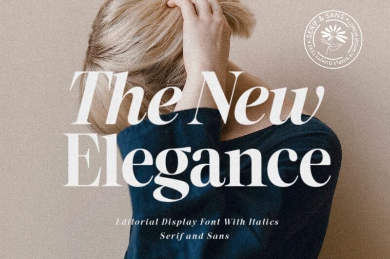
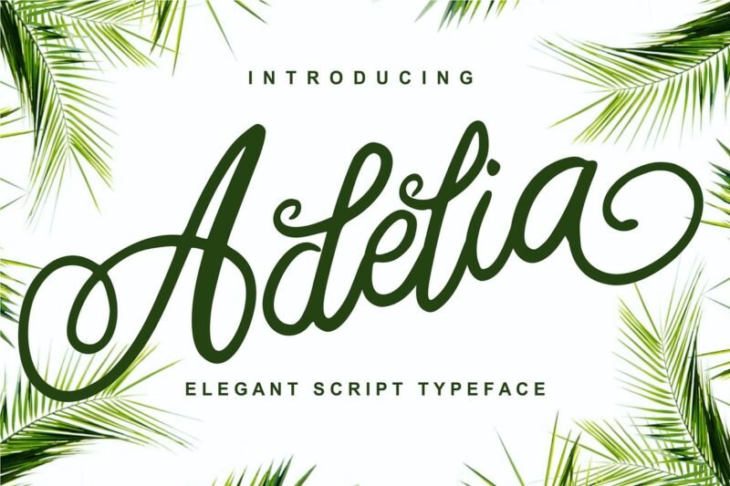
We’re seeing a big comeback for classic typography. At the center of this trend is the mix of serif and sans-serif fonts. The New Elegance Timeless Typography. Designers use serif and sans-serif fonts together to make their work stand out. This mix is essential in today’s design world. It ensures the content looks good and is easy to read. Let’s dive into why The New Elegance-Serif & Sans is so important. We’ll see how it can make designs more engaging and clear. The Power of Font Selection in Modern Design Choosing the right font is key in modern design. It can make a project stand out and grab attention. How we see and interact with designs depends a lot on the font. Historical Context and Evolution Fonts have changed a lot over time. We used to see serif fonts in print, but now sans serif fonts are everywhere online. Knowing this history helps designers pick the best fonts. Psychological Impact on Readers Fonts can really affect how we feel. Different fonts make us feel different things. For example, serif fonts feel old and reliable, while sans serif fonts seem new and simple. Designers pick fonts to make things better for users. They want to send a clear message and leave a good impression. So, picking the right font is very important in modern design. The New Elegance-Serif & Sans: Achieving Perfect Balance ‘The New Elegance-Serif & Sans’ makes it easy to find the perfect balance in typography. This font mix works well together. It adds a nice contrast that makes designs look better. Contrast is key in design. It makes things interesting to look at. By mixing serif and sans-serif fonts, designers can highlight important parts. Contrast as a Design Principle Contrast is about making things stand out. ‘The New Elegance-Serif & Sans’ combines old elegance with new simplicity. This makes it easy to create contrast. … The New Elegance Timeless TypographyRead more
Typeface
A Timeless Typographic Choice
I love exploring the world of typography. It’s where art and science meet. A Timeless Typographic Choice. This font has been loved for years. Its classic look and history make it special. It’s a mix of old and new that I find fascinating. The Aida 10 Font Ligature Serif is more than a font. It shows how typography changes our view of the world. Its timeless typography keeps it relevant, even as styles change. Understanding the Aida 10 Font Ligature Serif Aida 10 Font Ligature Serif is a top choice in serif fonts. It’s loved for its beauty and exactness. Its design is full of details and fancy ligatures. This font follows the long tradition of serif fonts. They are classic and easy to read. This makes them great for both digital and print. The Significance of Ligatures in Serif Fonts Ligatures are key in serif fonts like Aida 10. They join letters together into one. This makes the font look better and easier to read. The ligatures in Aida 10 show its high quality and care. They show the font’s focus on detail and excellence. Ligatures also show a deep understanding of language and communication. In short, Aida 10 Font Ligature Serif is a masterpiece in font design. … A Timeless Typographic ChoiceRead more
SLTF BOXROOM Modern Serif Typeface
As a designer, I’m always searching for the best typefaces. The SLTF BOXROOM caught my eye. SLTF BOXROOM Modern Serif Typeface. This mix makes it great for many projects. It works well in print and digital designs. The typography is both elegant and sophisticated. It’s perfect for designs that need a bit of luxury. The SLTF BOXROOM is a great choice for designers. In this article, I’ll dive deeper into its features and uses. Discovering SLTF BOXROOM: A Modern Serif Masterpiece SLTF BOXROOM is special in the world of serif fonts. It mixes old and new in a unique way. This typeface is a true work of art, with its detailed serifs and balanced letters. The design of SLTF BOXROOM makes it both beautiful and easy to read. The serifs are carefully made to add to its look. The letters are balanced, making the text clear. SLTF BOXROOM is perfect for any design project. It’s great for websites, magazines, or branding. Its modern style will make your design pop. Looking at SLTF BOXROOM, I see the skill in its design. It shows the beauty of font design, where every part is important. Key Features of SLTF BOXROOM – Modern Serif Typeface SLTF BOXROOM is known for its clear design, great for body text. It’s easy to read, thanks to balanced letters. This makes reading smooth. The serifs in SLTF BOXROOM add elegance and sophistication. They help guide the reader’s eye. This makes the text easier to read. Typography is at the heart of SLTF BOXROOM’s design. … SLTF BOXROOM Modern Serif TypefaceRead more
Explore the Captivating Enwicken
We’re excited to explore the Enwicken Slab-Serif Typeface. It has won the hearts of many designers and typography fans. Explore the Captivating Enwicken. This typeface is more than just a font. It’s a statement in typography. It combines elegance with strength, making any design better. The Story Behind Enwicken Slab-Serif Typeface The Enwicken Slab-Serif Typeface was made with care. Its designers wanted a font that could be used in many ways. It should work well for both digital and print projects. This typeface is special because it mixes old typography ideas with new ones. It’s a fresh addition to typography, meeting the changing needs of creators. Design Philosophy The Enwicken Slab-Serif was designed to be both useful and beautiful. The designers made sure it’s easy to read on different platforms. This includes screens and printed pages. It combines the strength of slab-serif fonts with the beauty of fine typography. This makes it a great choice for designers. It shows a deep understanding of typography and its importance in sharing messages. This typeface is not just unique in typography. It’s also a useful tool for artists. It adds elegance and clarity to any project, whether it’s headlines or body text. Distinctive Features of the Enwicken Slab-Serif The Enwicken Slab-Serif focuses on details to make a big impact. It has robust slab-serifs that look good and make reading easier. Explore the Captivating … Explore the Captivating EnwickenRead more
Kpop Vibes Korean Font
If you love K-pop, you’ll adore the Kpop Vibes Korean Font I’m about to show you. The Kpop Vibes Korean … Kpop Vibes Korean FontRead more
Timeless Fashion Elevated
Timeless Fashion Elevated. for elevated fashion. You’ll learn about the attention to detail and commitment to excellence that makes it … Timeless Fashion ElevatedRead more
Adelia – Elegant Script Typeface
Adelia – Elegant Script Typeface is not just beautiful; it’s also very versatile. It’s a script font that can make your designs look better. It combines classic and modern styles, adding sophistication to any project. Using this elegant typography in your work can make your designs more interesting. It adds depth and visual appeal, helping your designs stand out. The Story Behind Adelia Typeface The making of Adelia Typeface is a tale of love and hard work in typography design. As a typeface designer, I’ve delved deep into font history and beauty. Creative Journey My creative path started with jotting down ideas. I looked at many styles until I found the elegant script of Adelia. This step was key in shaping the font’s special look. … Adelia – Elegant Script TypefaceRead more
bromello typeface Font
I recently found the Bromello typeface font and I’m excited to share it with you. This distinctive font can make … bromello typeface FontRead more