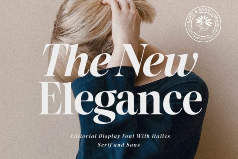
We’re seeing a big comeback for classic typography. At the center of this trend is the mix of serif and sans-serif fonts. The New Elegance Timeless Typography. Designers use serif and sans-serif fonts together to make their work stand out. This mix is essential in today’s design world. It ensures the content looks good and is easy to read. Let’s dive into why The New Elegance-Serif & Sans is so important. We’ll see how it can make designs more engaging and clear. The Power of Font Selection in Modern Design Choosing the right font is key in modern design. It can make a project stand out and grab attention. How we see and interact with designs depends a lot on the font. Historical Context and Evolution Fonts have changed a lot over time. We used to see serif fonts in print, but now sans serif fonts are everywhere online. Knowing this history helps designers pick the best fonts. Psychological Impact on Readers Fonts can really affect how we feel. Different fonts make us feel different things. For example, serif fonts feel old and reliable, while sans serif fonts seem new and simple. Designers pick fonts to make things better for users. They want to send a clear message and leave a good impression. So, picking the right font is very important in modern design. The New Elegance-Serif & Sans: Achieving Perfect Balance ‘The New Elegance-Serif & Sans’ makes it easy to find the perfect balance in typography. This font mix works well together. It adds a nice contrast that makes designs look better. Contrast is key in design. It makes things interesting to look at. By mixing serif and sans-serif fonts, designers can highlight important parts. Contrast as a Design Principle Contrast is about making things stand out. ‘The New Elegance-Serif & Sans’ combines old elegance with new simplicity. This makes it easy to create contrast. … The New Elegance Timeless TypographyRead more
