Design Maison – Hybrid Display Font: The Typographic Standard for Luxury Creative Work
Introduction to Design Maison
In typography, the most powerful fonts don’t shout. They command.
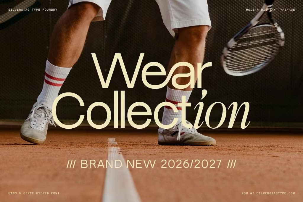
Design Maison is exactly that kind of typeface — a sophisticated hybrid display font that occupies the rare space between classical elegance and sharp contemporary minimalism. It doesn’t lean entirely into ornate tradition, nor does it strip itself down to cold geometric abstraction. It holds both worlds in perfect, deliberate tension.
The result is a font that reads as unmistakably modern while carrying the structural authority of something that has always existed at the top of the market. For designers working with luxury clients, premium brands, or editorial publications that demand typographic gravitas, Design Maison is the answer to a brief that most fonts can’t fully satisfy.
Design Features & Geometric Fluidity
What separates Design Maison from conventional display fonts is the quality of its structural decisions. Every letterform reflects a considered balance between geometric precision and organic curve — tight where it needs authority, fluid where it needs grace.
The high-contrast stroke design is immediately arresting on screen. The transition from razor-thin hairlines to bold, weighted strokes creates a visual rhythm that pulls the eye across a headline with genuine elegance. At large display sizes, this contrast becomes the defining visual feature of any layout it inhabits.
Standout design features include:
- Hybrid construction that merges classical serif sensibility with modern geometric structure
- High-contrast stroke variation between thick and thin elements for dramatic visual depth
- Unique character curves with refined terminals that feel architectural rather than accidental
- Alternate ligatures and glyphs for typographic customization and added compositional control
- Strong display performance at both large headline sizes and medium editorial applications
- Clean vector precision that reproduces flawlessly across digital screens, large-format print, and luxury packaging
The alternate character set is particularly valuable for designers who need flexibility within a single typographic system. Small adjustments to individual letterforms can shift the entire personality of a layout — from sharp and editorial to soft and approachable — without ever leaving the font family.
Best Creative Use Cases
High-End Fashion Editorial Layouts & Luxury Magazine Headlines
Fashion publishing operates at the highest level of typographic scrutiny. Every headline choice communicates something about the publication’s cultural positioning, and Design Maison communicates confidence, taste, and editorial authority.
It performs beautifully across spread layouts, section openers, cover headlines, and pull quotes. Against high-fashion photography, it holds its presence without competing — which is the precise quality that separates a great editorial font from a merely attractive one.
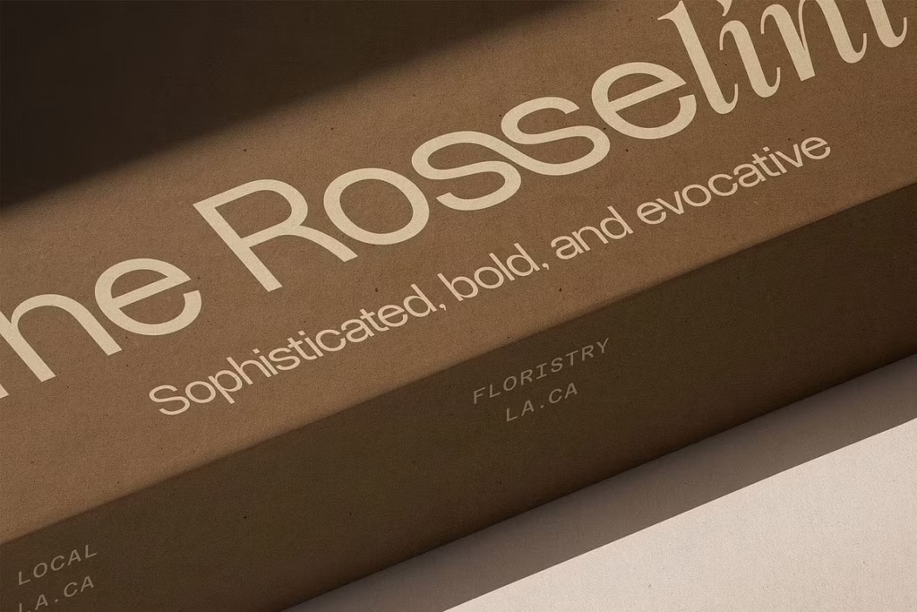
Premium Product Packaging — Cologne, High-End Skincare & Fine Wine Labels
Luxury product packaging asks typography to carry enormous commercial weight. A consumer standing at a retail shelf makes a quality judgment in seconds, and the font on the label is doing most of the persuasive work.
Design Maison is built for exactly this pressure. Its structural authority and refined aesthetic signal premium quality instantly — on cologne bottles, glass skincare packaging, fine wine labels, and spirits bottles where the visual language of the label must match the price point of the product inside.
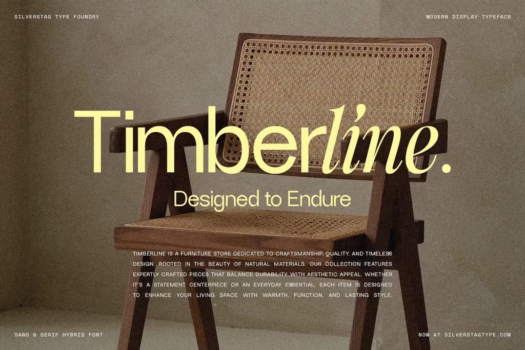
Boutique Branding, Corporate Wordmark Logos & High-End Identities
For brand identity work at the premium end of the market, Design Maison provides a typographic foundation that is both distinctive and enduring. It doesn’t chase trends — it establishes them for the brands that use it.
As a wordmark font, it gives boutique fashion houses, luxury real estate firms, premium wellness brands, and high-end hospitality businesses a visual identity that communicates sophistication before a single word of brand messaging is read. For corporate identity systems, it anchors the entire visual language with quiet, unwavering authority.
Agency designers presenting brand concepts to luxury clients will find that Design Maison elevates the credibility of a pitch deck the moment it appears in the mockups. Clients who spend significant budgets on brand identity recognize quality typography instinctively, and this font speaks directly to that recognition.
Why Creative Professionals Need This Style
Premium minimalism is the dominant aesthetic language of luxury branding right now — and maintaining it across a complete design system requires typographic tools that carry inherent visual weight without needing layers of supplementary decoration to justify their presence.
Design Maison does exactly that. Drop it into a layout and the composition immediately has a point of view. The surrounding design elements — color, white space, imagery, hierarchy — snap into alignment around it because the font is already doing the heavy atmospheric work.
For agency designers and senior art directors managing high-value client relationships, that efficiency is significant. Less time spent establishing the visual direction means more time refining the details that make a premium deliverable genuinely exceptional rather than merely competent.
Freelance designers building luxury-tier portfolios benefit equally. Having a font like Design Maison in your active toolkit positions your work firmly in the premium category — the kind of work that attracts higher-budget clients and commands higher project rates.
Conclusion & Call to Action
Design Maison is not a decorative novelty. It’s a professional typographic instrument designed for the highest tier of creative work.
From luxury fashion editorials and high-end magazine headlines to premium product packaging and elite brand identity systems, it performs with consistent authority across every application that demands genuine sophistication. Its hybrid construction, high-contrast stroke design, and refined alternate character set make it one of the most versatile and visually powerful display fonts available to professional designers today.